Most people still think better words equal better images. That was true two years ago. Not anymore.
In 2026, the real gap is not between models. It is between users who describe and users who construct. One group types “cinematic lighting, 4k, ultra detailed.” The other group builds scenes — light direction, depth layers, camera angles.
If your images still look flat, the problem is probably not the model. It is what you are not telling it.
Why Your Prompts Are Not Enough (2026 Perspective)
Generic prompts have stopped working. Models have seen phrases like “best quality” and “high detail” millions of times. Those words barely move the needle now.
What actually matters? Structured inputs. Where does the light come from? What is in the foreground versus the background? Which lens are you using? Modern models respond to these variables. They ignore fluff.
Here is a common pattern. Someone writes: “a beautiful portrait with soft lighting.” The model delivers something flat. Why? No light direction. No depth separation. No camera angle. The model has to guess. And guessing leads to average results.
The shift you need to make is simple. Stop describing the outcome. Start constructing the scene.
The 7 Advanced Tips
-
Tell the light where to go
“Soft lighting” is vague. Side lighting, backlighting, top‑down — those give the model something concrete. Direction creates shadows. Shadows create depth. Depth makes an image look real.
Try this instead of “soft portrait lighting”:
A portrait of a woman, side lighting from the left, soft shadows on the right side of the face, subtle ambient light from the background
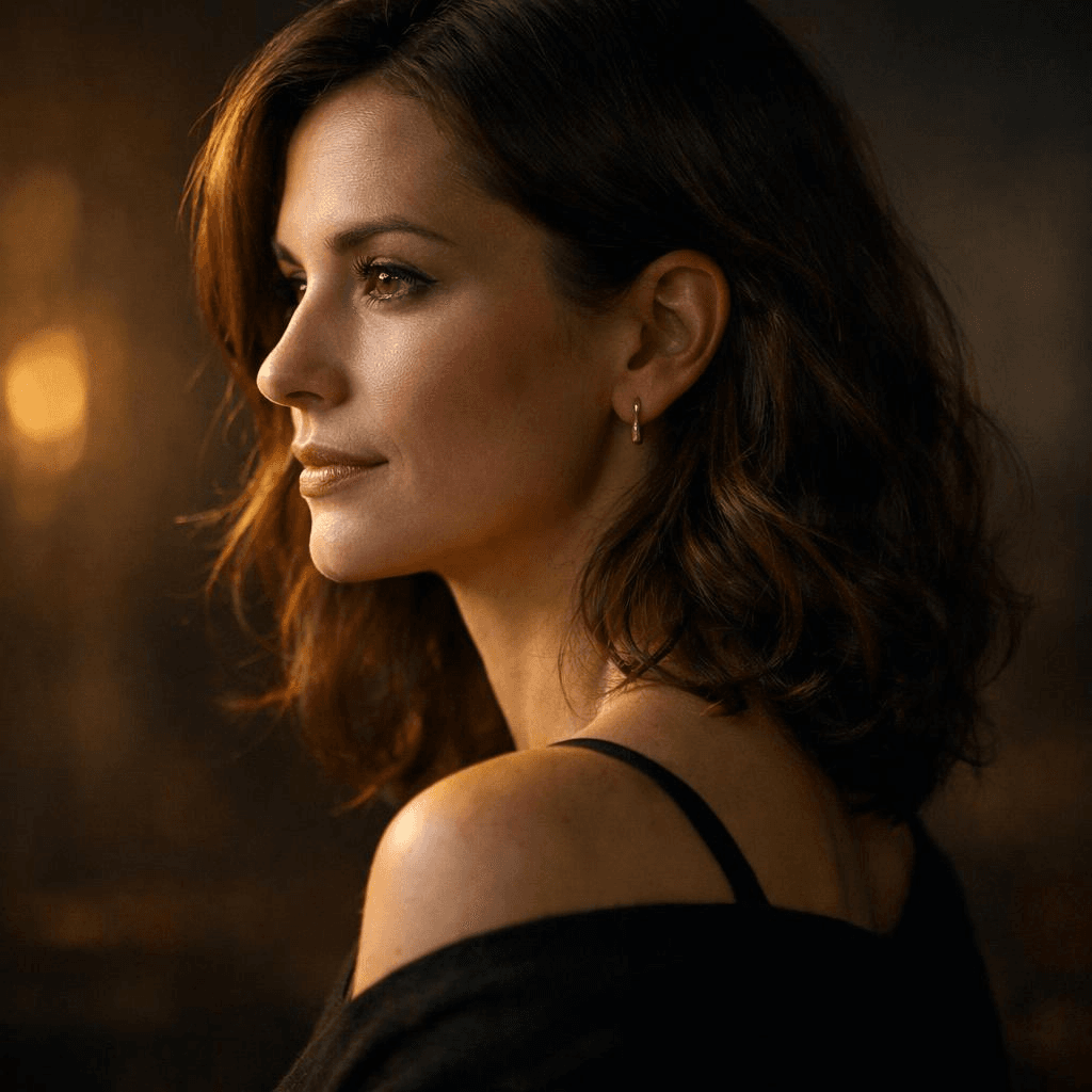
You can see the difference immediately. The model knows exactly where the light sits.
-
Use real photography setups
Three‑point lighting. Rim lighting. Rembrandt lighting. These are not just fancy terms. They are patterns the model saw thousands of times during training. Use them and your outputs become more stable.
Example:
Product shot of a sneaker, three-point lighting setup, strong key light, soft fill light, subtle rim light separating the product from a dark background
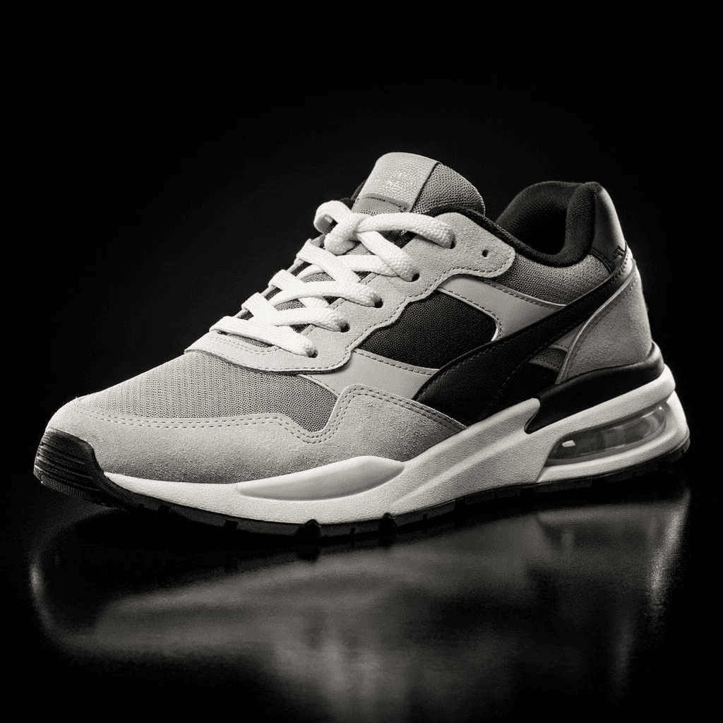
That works better than “dramatic lighting” every time.
-
Build depth layer by layer
Flat images usually mean everything sits on the same plane. Fix it by naming foreground, midground, and background explicitly.
Example:
A coffee cup on a wooden table (foreground), a person working on a laptop (midground), a softly blurred café interior with warm lights (background)

Now the model has spatial relationships to work with.
-
Use camera language, not style labels
“Cyberpunk style” is fuzzy. “35mm lens, low angle, wide shot” is precise. Camera settings map directly to how images are built.
Keep these in your pocket:
- 35mm for a natural, everyday look
- 85mm for portraits with compression
- Wide‑angle for drama and scale
- Low angle, eye‑level, top‑down for perspective
Example:
A close-up portrait, 85mm lens, shallow depth of field, eye-level angle, soft background blur
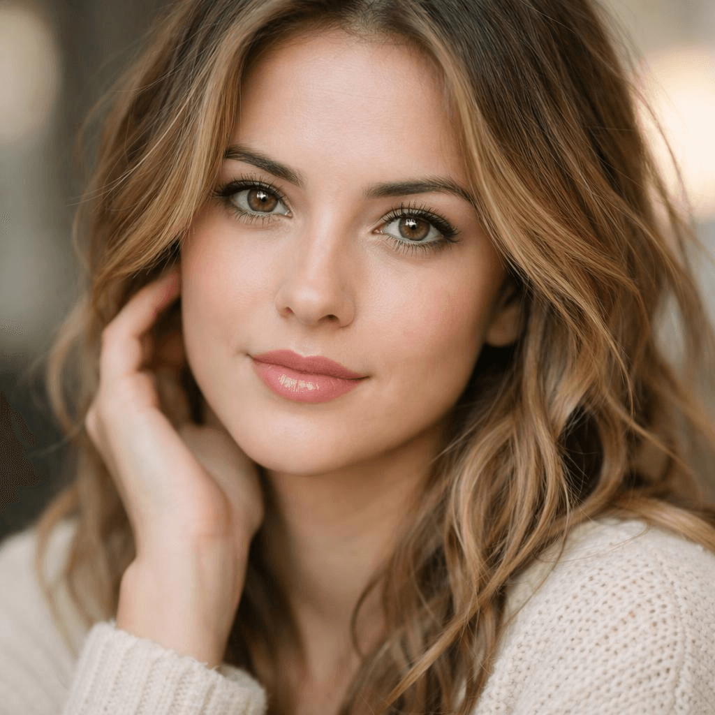
That gives the model much clearer instructions than “aesthetic portrait.”
-
Guide attention through contrast
High detail everywhere is not the goal. Contrast is. Light versus shadow. Warm versus cool. Sharp subject versus blurred background.
Three types of contrast work well:
- Light contrast: bright subject against a dark background
- Color contrast: warm spotlight on a cool-toned background
- Detail contrast: sharp subject, blurry environment
Example:
A subject illuminated by a warm spotlight against a dark, cool-toned background, high contrast lighting, strong subject focus
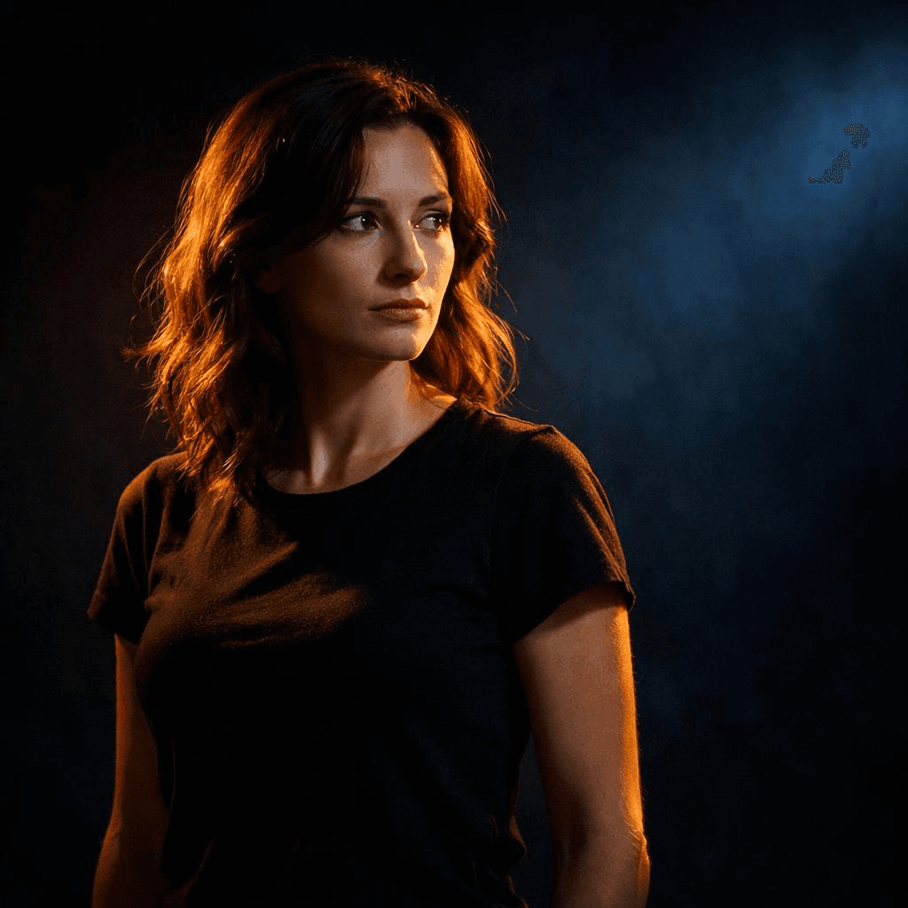
The viewer’s eye goes exactly where you want it.
-
Add constraints to clean up chaos
duce cleaner and more controlled compositions.
Long prompts get messy. Instead of adding more details, add limits. Tell the model what you do not want. No clutter. No distortion. No extra objects.
Example:
Minimalist product shot, centered composition, clean white background, no clutter, no text, no distortion

Constraints often do more than extra descriptions.
-
Iterate like a director, not a gambler
Nobody gets the final image on the first try. Professionals generate, tweak, generate again.
A simple workflow:
- Step one: basic composition, subject and environment
- Step two: add directional lighting and contrast
- Step three: refine details, remove clutter
Each pass improves the result. That is how you move from luck to consistency.
Putting It All Together — A Professional Prompt Framework
Stop writing prompts as long sentences. Write them as modular systems.
Here is a structure that works:
plaintext1[Subject] + [Environment] + [Lighting] + [Camera] + [Composition] + [Color] + [Constraints]
Look at the difference between a basic prompt and a structured one.
Example: From Basic Prompt to Professional Prompt
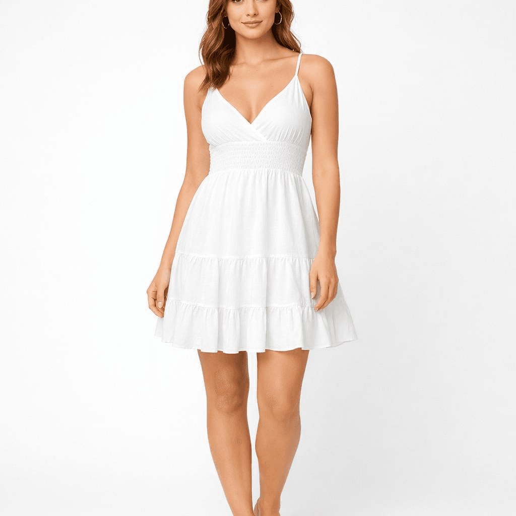
Basic Prompt (Typical User):
A female model wearing a white summer dress, clean background, studio lighting, high detail, e-commerce style
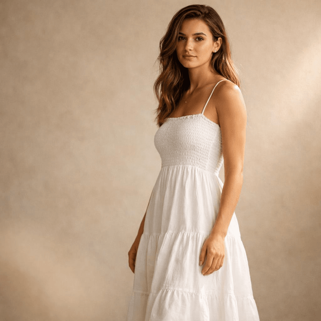
Professional Prompt (Structured):
A female model wearing a white summer dress (subject), standing in a minimalist studio with a soft beige textured background (environment), side lighting from the right creating soft shadows on the left side of the body, subtle rim light separating the silhouette from the background (lighting), shot with an 85mm lens, eye-level angle (camera), subject slightly off-center with shallow depth of field, soft foreground blur adding depth (composition), warm natural tones, soft contrast (color), clean composition, no clutter, no distortion, no extra objects (constraints)
Conclusion — From Prompting to Directing
Getting a single great image is fine. But real projects need hundreds of consistent, high‑quality visuals. Manual prompting does not scale.
You run into practical problems. Latency. Cost per image. Maintaining the same visual style across batches. Prompt design alone cannot solve these. You need a system.
That is where API‑based image generation becomes essential. Instead of typing prompts into a playground every time, you integrate generation into your workflow. Structured prompts get reused. Automated. Optimized over time.
Platforms like Atlas Cloud provide a unified API layer for this.
And if you are:
• Developers who want easy, affordable AI access. • Teams handling projects that need AI across multiple areas. • Businesses needing reliable AI for important work. • People using tools like ComfyUI and n8n.
Try AtlasCloud, and you'll find yourself move from experimenting to producing. No need to rebuild infrastructure from scratch.
The future is not about writing better prompts in isolation. It is about building controllable, repeatable, production‑ready visual systems.
FAQ
Why do my AI images still look flat?
Flat images usually mean you left out depth cues. Think about how photography works. Depth comes from shadows, things overlapping, and differences in focus. Your prompt has to spell those out.
Take a simple prompt: "a person sitting at a desk." That tells the model almost nothing about depth. Try something like this instead: "a person sitting at a desk (midground), a blurred window with city lights (background), a coffee cup in sharp focus (foreground)." Now the model has layers to work with.
Lighting is another place people mess up. A lot of prompts only mention ambient light. That gives you flat, even illumination across the whole image. Add a directional source. Side light. Backlight. Rim light. Pick one. The model will start casting shadows, and suddenly your image has volume.
One more thing. Do not try to fill every corner of the frame with detail. Empty space and blur are useful. They tell the viewer where to look. Sometimes less detail gives you more depth.
Can AI replace product photography?
Yes, for a lot of cases. But let's be honest about where it works and where it doesn't.
If you need a hero shot for a luxury watch — the kind where every reflection on the metal matters, and the texture of the leather strap has to be exact — traditional photography still wins. You cannot beat a real studio for that.
For almost everything else, AI is faster and cheaper. Catalog images. Lifestyle scenes. Seasonal variations. A/B test creatives. You can generate a clean product shot on a white background in seconds. Then take that image and drop it into a beach scene, a winter cabin, or a modern kitchen using an AI product photography generator.
No studio rental. No lighting rig. No retouching. Each image costs pennies.
For small brands and direct‑to‑consumer startups, this changes the game. They can now produce visuals that compete with companies that have big budgets. That was not possible two years ago.
How does the OpenAI visual generation model differ from previous versions?
The new model, GPT‑image‑1.5, has a few architectural changes under the hood. It uses a diffusion transformer. That is a fancy way of saying it handles spatial relationships better.
Older versions often broke complex scenes into pieces that did not quite fit together. A hand might float near a cup instead of holding it. Shadows would point in wrong directions. The new version keeps things connected. A hand holds the cup. The shadow falls where it should.
Text rendering is another big jump. Earlier models produced garbled characters that looked like random symbols. GPT‑image‑1.5 generates readable words in multiple languages. You can mix English and Chinese in the same image. That actually works now.
The model also supports higher resolutions natively — up to 2K without upscaling. Fewer artifacts. Sharper details.
There is a downside. The model is less forgiving of vague prompts. You cannot just say "a nice portrait" and expect magic. You have to be more careful. But when you give it structured instructions — light direction, depth layers, camera settings — the output quality is better than anything from previous generations.


