Ask an image model to spell five exact phrases and you usually get four right and one embarrassment. On the morning of July 20, 2026, a creator ran that exact gauntlet through Seedream 5.0 Pro, and the embarrassment never came.
Text is where AI images still get caught. A gorgeous poster with "FEARLES" in 200-point type is worthless. So this article stays on that one question: how far can you trust Seedream 5.0 Pro with typography, across posters, UI mockups, and data-dense infographics, and where does it still drop letters.
Key Takeaways
- In a July 20 head-to-head against Nano Banana Pro, a five-string exact-text poster prompt came back with zero spelling errors in both renders. The difference between them was typographic interpretation, not accuracy.
- ByteDance pitches Seedream 5.0 Pro as a design engine: dense multi-tier text, one-pass infographics, UI layouts, and splitting a poster into 10+ editable layers. It also admits "finer-grained text rendering" still needs work.
- An infographic AI renders text; it does not compute data. Supply every number and label yourself, or the chart will invent them.
- Crowd leaderboards split on this model: #11 on the Arena (LMArena) board, ahead of Recraft's best entry, but absent from the Artificial Analysis table so far.
- On Atlas Cloud it runs from $0.045 per image, so a full typography stress test costs less than a dollar.
The Seedream 5.0 Pro Poster Test: Two Models, Zero Typos
The best public text-rendering test of Seedream 5.0 Pro so far is a fashion poster. Creator @ZunairaAi ran one prompt through Seedream 5.0 Pro and Google's Nano Banana Pro on July 20, 2026, and posted both results. Her prompt buries a brutal typography clause inside a 9:16 monochrome editorial brief:
Include clean, sharp, premium typography with exact text: top center "MODE & POWER", left upper quote "STYLE SPEAKS BEFORE WORDS DO.", large bold text on the left "FEARLESS", large vertical text on the right "ICONIC", and a small vertical handle block near the lower left "@style.muse".
Five strings. Five positions. One ampersand, one period-ended sentence, one @-handle with a dot in it. This is the stuff that used to melt image models. Here are the two renders exactly as posted, in post order:
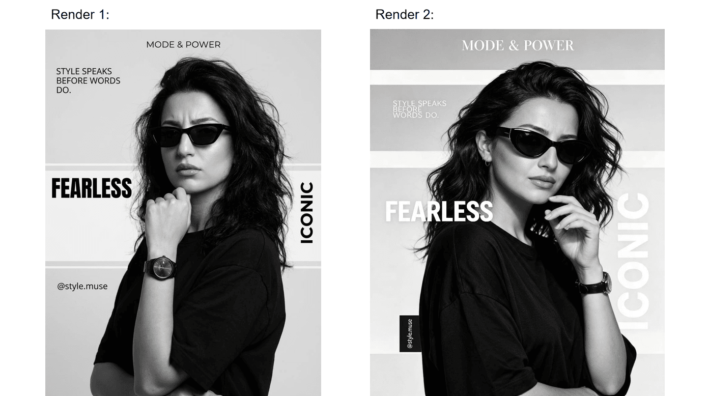
Both images from the original post by @ZunairaAi. (Re-host before publishing.)
We checked every string in both renders against the prompt:
| Prompt requirement | Render one | Render two |
|---|---|---|
| "MODE & POWER" top center | Correct, clean sans-serif | Correct, set in a serif masthead |
| "STYLE SPEAKS BEFORE WORDS DO." upper left | Correct, three lines | Correct, lighter weight |
| "FEARLESS" large bold left | Correct, black on a white band | Correct, white overlay |
| "ICONIC" large vertical right | Correct | Correct, oversized and layered behind the subject's arm |
| "@style.muse" as a small vertical block | Text correct, but set horizontally, no block | Correct, and actually built as a vertical black block |
The scorecard: ten out of ten strings letter-perfect across both images. The post does not label which render came from which model, so we won't guess. The logic still holds either way: whichever image is Seedream's, it cleared all five strings without a typo.
The one instruction that separated the two renders was not spelling. It was typesetting. Only one render honored "small vertical handle block" as an actual block element. That is the current frontier: exact text is close to solved for short display copy, and the competition has moved to whether the model thinks like a layout artist. Her prompt also ends with a 17-item blocklist that includes "inaccurate text, text errors" as insurance; we took that full prompt apart line by line in our prompt guide.
What ByteDance Claims Seedream 5.0 Pro Can Do With Text and Layout
That poster result is not an accident. Text and layout are exactly what ByteDance says it built this model for. The launch post is titled "Beyond Generation, It Understands Design," and the official showcase backs each claim with worked examples. Here is the claim set, mapped against what has actually been verified outside ByteDance:
| Official claim | ByteDance's own demo | Independent signal so far |
|---|---|---|
| Dense, multi-tiered text with well-judged spacing | An RPG stat sheet with dense stat columns; a poster explaining Chomsky's linguistic theory | The five-string poster test above |
| Typography adapts to each language's rules | A medical poster translated into right-to-left Arabic with layout preserved | A Japanese field test, covered below |
| One-pass infographics | A single frame combining a timeline, a line chart, a bar chart, and a realistic view | Thin. Mostly platform marketing so far |
| UI layouts with real spatial logic | A pet e-commerce hero banner; a SaaS hero section | Thin. No rigorous third-party test yet |
| Layer separation | A poster split into 10+ independent layers, text included, with transparency | Confirmed as a day-one capability |
Two honest notes belong next to that table. First, ByteDance concedes the ceiling in its own launch post: "there is still room to improve in finer-grained text rendering." You do not have to take that sentence on faith. Here is the RPG interface demo from the official gallery, the image behind the dense-text claim in the first row:
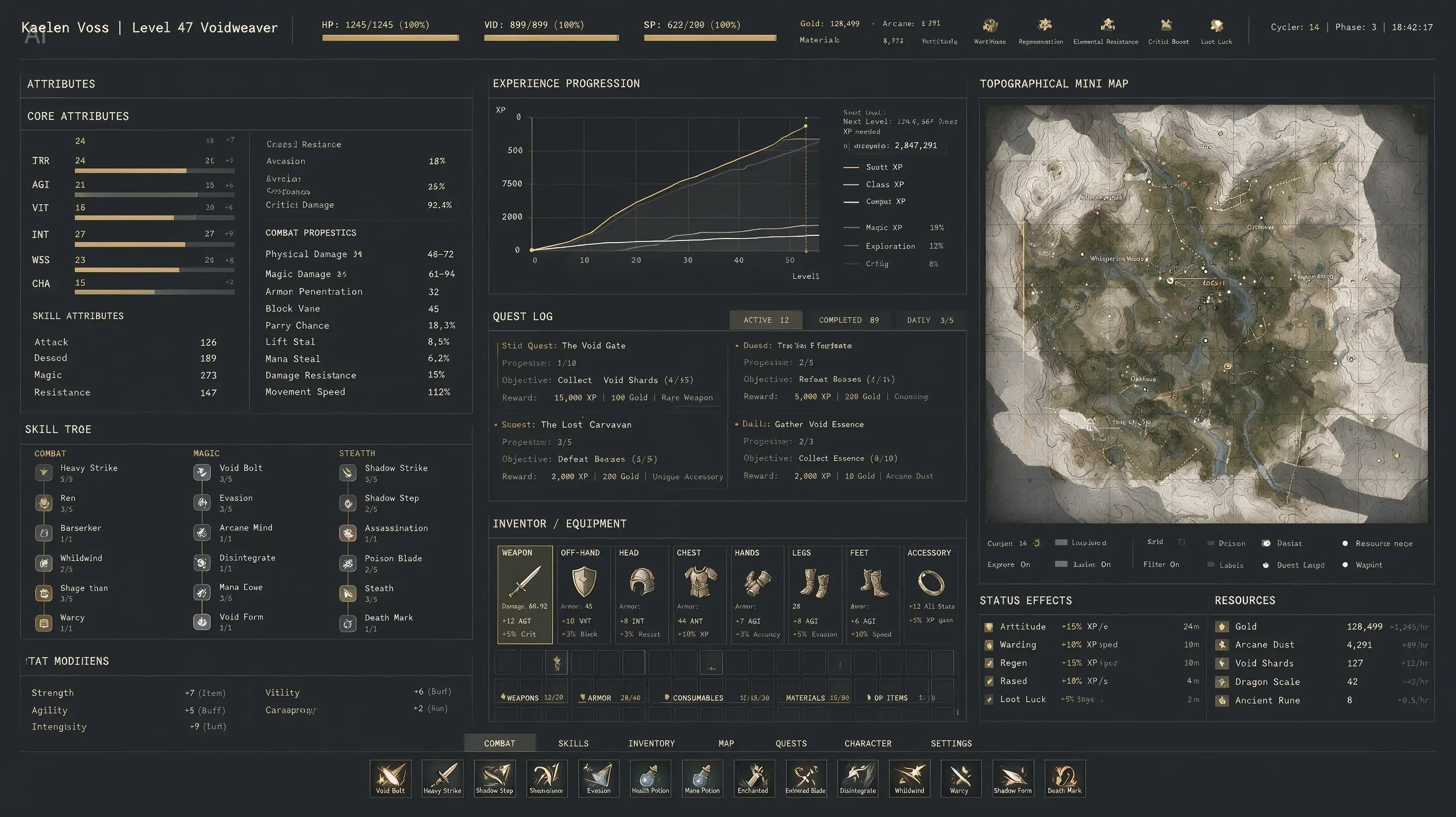
From ByteDance's official showcase gallery. (Re-host before publishing.)
Read it at two zoom levels. The structure is genuinely impressive: panels, charts, an inventory grid, and every large header lands clean. Now read the small labels: "SKILL TROE," "Armor Penenration," "INVENTOR / EQUIPMENT." Short headlines are the strength; fine print is not, and ByteDance's own gallery shows both in one frame.
Second, the "independent signal" column is thin for infographics and UI because the model is twelve days old on public APIs. That gap is why running your own tests matters, which brings us to the how.
Running Text-Heavy Seedream 5.0 Pro Prompts on Atlas Cloud
Every test in this article is reproducible for pocket change. Seedream 5.0 Pro runs on Atlas Cloud alongside the rest of the ByteDance model family, and the Seedream 5.0 Pro playground takes pasted prompts with no setup. Specs that matter for typography work, verified July 20, 2026:
| Spec | Value | Why it matters for text work |
|---|---|---|
| Price | From $0.045 per image ($10 ≈ 222 runs) | A 10-poster stress test costs about $0.45 |
| Resolution | 1.5K tier (~2.36M pixels) and 2K tier (2048×2048 cap) | Small type needs pixels; use the 2K tier for dense layouts |
| Aspect ratios | Any ratio from 1:16 to 16:1 | Posters, banners, and phone UI all have native frames |
| Output | JPEG or PNG, 1 image per run | PNG for design handoff; no four-image grid |
| Thinking toggle | On by default | The reasoning pass is what parses multi-string layout briefs |
| Prompt budget | Under 600 English words recommended | Label-heavy infographic prompts eat this fast |
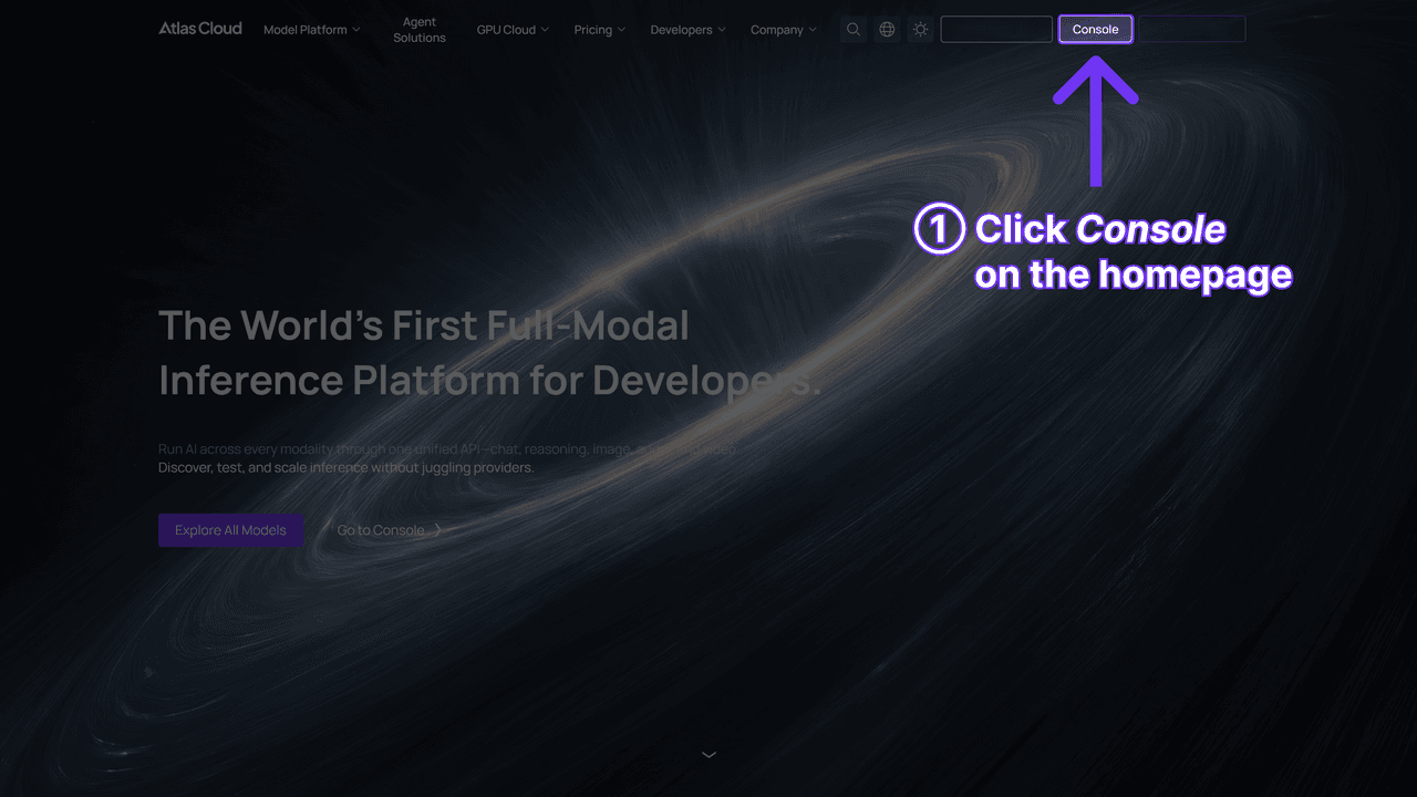
Method 1: the playground. Log in, paste a prompt, and mind two controls. Set the size explicitly, because the default is 16:9 at 2048×1152 and a 9:16 poster brief will fight it. And leave Thinking on for anything with exact text; turning it off is a speed lever for rough drafts, nothing more. The Run button quotes the exact price before you commit.
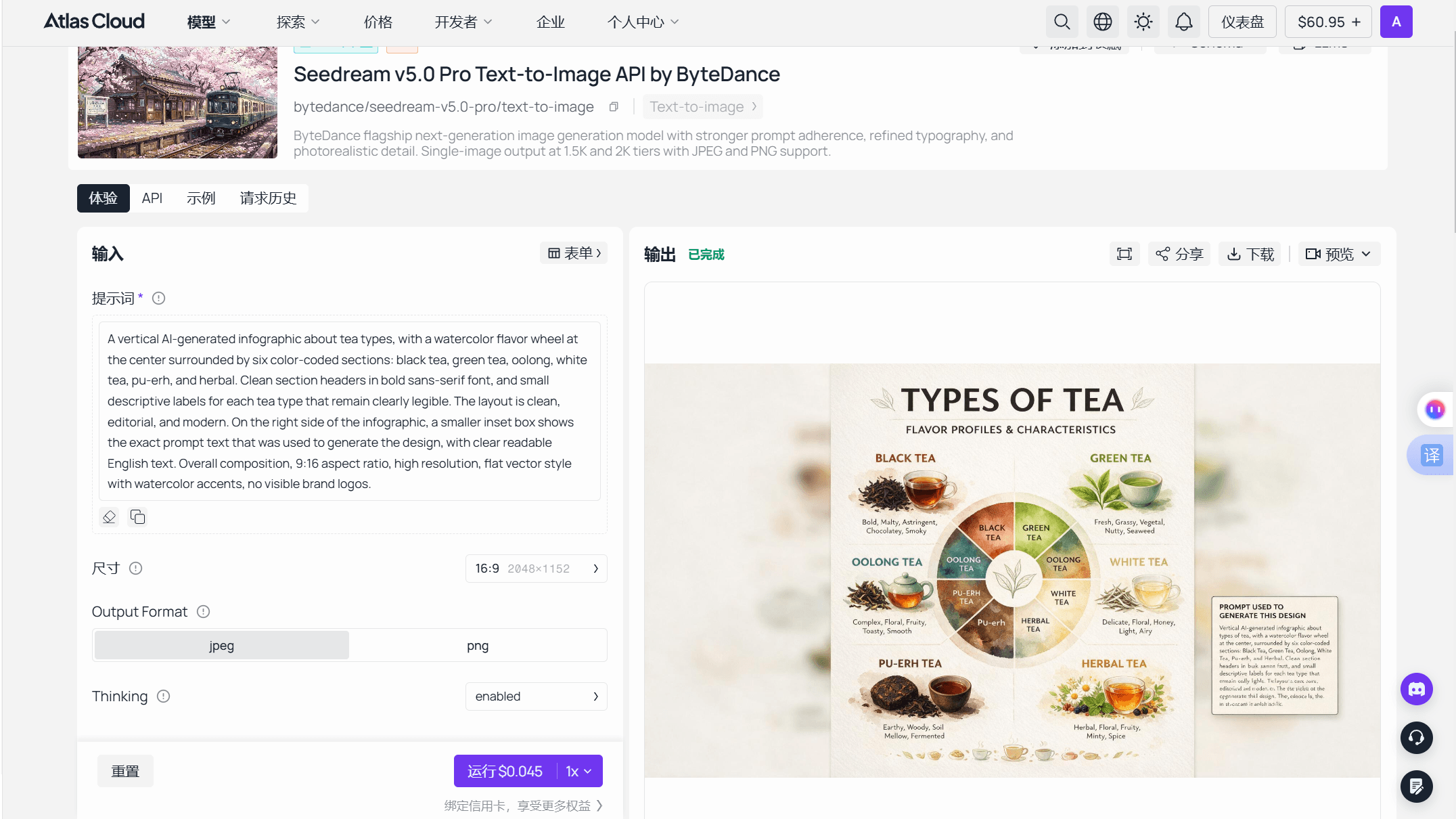
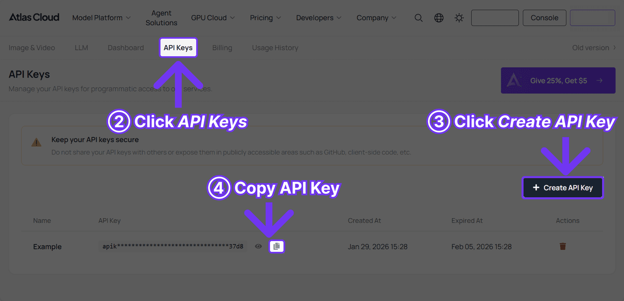
Method 2: the API. Create a key in the Atlas Cloud console, then submit to the generateImage endpoint and poll the returned prediction ID. The API documentation covers the schema. One trap for typography work: the API's default size is 2048×2048, not the playground's 2048×1152, so always pass size explicitly. The whole platform runs as One API, so the day a better design model ships, you change one model string and keep the pipeline.
Seedream 5.0 Pro as an Infographic AI: What One-Pass Data Layouts Get You
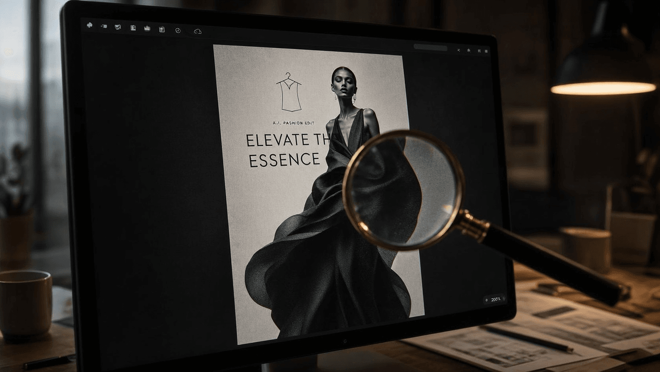
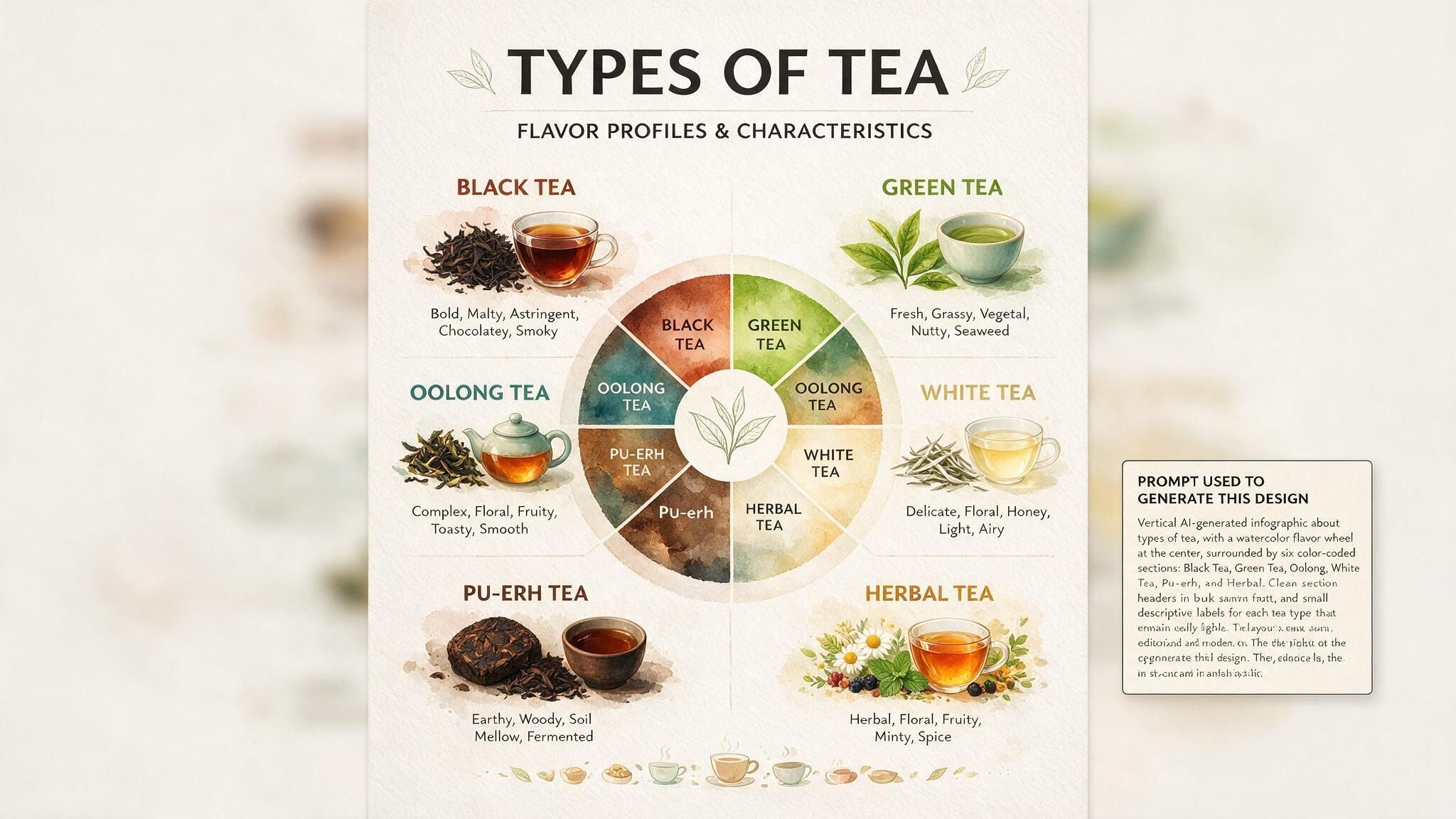
Infographics are the showcase ByteDance leans on hardest, and the demos are genuinely ambitious: a Día de los Muertos explainer in 4:5, a Montessori education poster, a tea flavor wheel in watercolor gradients, and that four-element composite mixing a timeline with two chart types and a realistic scene. The pitch is one prompt in, a finished information layout out, with hierarchy and spacing handled for you.
Before you wire that into a content pipeline, internalize the one sentence that separates useful output from misinformation: the model renders text, it does not compute data. A bar chart from an image model is a picture of a bar chart. Bar heights will not be proportional to your numbers unless luck intervenes, and any figure you fail to supply will be invented with total confidence. That is fine for a layout draft and fatal for a published statistic.
The practical recipe that follows from this:
| Layout element | How to prompt it |
|---|---|
| Title and subtitle | Quote exact strings, state positions: top center "..." |
| Section structure | Zone the canvas: "left column lists three steps, right column shows..." |
| Charts | Name the chart type, then give every number, label, and axis yourself |
| Callouts | One short quoted string each; skip body paragraphs entirely |
| Palette and mood | A short named palette, like the official demo's "warm ivory, light wood, sage green, and creamy yellow" |
| Format | Declare it: "vertical 4:5 infographic poster" |
Budget check: with every label quoted, a serious infographic prompt runs 300 to 500 words, still inside the recommended 600-word ceiling but close enough to plan for. Spend words on strings and structure, not on adjectives.
Seedream 5.0 Pro for UI Mockups and Complex Layouts
UI is the least independently tested claim in the set. The official examples are a pet e-commerce homepage hero, with a navigation header, marketing copy, product cards, and a golden retriever whose paw breaks the frame boundary between design zones, plus a SaaS hero section built around the headline "Orchestrate AI Workflows at Scale." ByteDance attributes this to the model's grasp of "spatial topology": it knows a navigation bar sits above a hero, and that a floating card can overlap both.
Read those examples carefully and the honest use case comes into focus. This is a concept-art engine for interfaces, not a design tool that outputs components. You get pixels, not Figma frames, no design tokens, no CSS, and every button label is baked paint. What that is actually good for:
- Pitch and portfolio imagery. A plausible product homepage in one pass, faster than assembling a mockup from UI kits.
- Landing-page art direction. Generate five layout directions before committing design hours to one.
- Marketing frames. App-store-style hero shots where the UI is a prop inside a larger composition.
Prompt UI the way the official demos do: name the regions in order (header, hero, card row, footer), give exact strings for the navigation items and the headline, and keep button copy to one or two words. Region words matter more than style words here, because the model's layout logic keys off named zones.

Multilingual Typography: Seedream 5.0 Pro Text Rendering Beyond English
English display type is table stakes. The harder test is whether a model respects other writing systems, and this is where Seedream 5.0 Pro's claims get specific. The launch post says it natively generates text in "over ten commonly used languages," and that typography adapts per script: right-to-left cursive for Arabic, accent marks for Spanish, standard character forms for Chinese. The showcase demonstrates a subway safety notice rendered in English, Chinese, Japanese, and Korean, and a medical poster translated into Arabic with the layout and palette intact.
There is early field evidence beyond ByteDance's own gallery. Japanese creator @akiyoshisan tested Japanese text and reference-image consistency through ByteDance's Dreamina app on July 9, one day after launch. His verdict, translated from Japanese: the model has become "considerably stronger" at Japanese text, and he already uses the Seedream series for video storyboard frames. One of his test images is instructive: a cyberpunk samurai poster with the English title "Seedream 5.0 Pro" set clean at the top and the Japanese tagline 日本語、いける? crisp at the bottom. Mixed Latin and CJK type in one frame, both correct.
| Script challenge | What the model handles | Evidence |
|---|---|---|
| Right-to-left scripts | Arabic layout mirroring, cursive joining | Official medical-poster demo |
| CJK plus Latin in one frame | Mixed English and Japanese display type | @akiyoshisan's samurai test |
| Multi-language signage | Same notice in four languages, consistent hierarchy | Official subway-sign demo |
| Diacritics | Spanish accent marks reproduced | Official launch post |
Practical notes: keep each text block in one language rather than mixing scripts inside a sentence, and quote non-Latin strings exactly as you want them rendered. The language list is deep but not infinite; if your target language is outside the commonly-used set, test before promising a client anything.
Seedream 5.0 Pro vs Recraft: Picking a Complex-Layout AI Tool
Any conversation about AI typography eventually reaches Recraft, the design-first model line whose V3 topped the text-to-image leaderboards in late 2024. ByteDance's own Seedream 3.0 took that crown in April 2025, beating Recraft V3 directly. The two lineages have traded punches ever since, and the July 2026 scoreboard is genuinely split:
| Leaderboard | Seedream 5.0 Pro | Recraft's best entry | As of |
|---|---|---|---|
| Arena text-to-image (LMArena) | #11, score ~1231 | Recraft V4.1 Utility Pro at #19 | Mid-July 2026; Pro added July 11 |
| Artificial Analysis | Not yet ranked (5.0 Lite sits mid-table) | Recraft V4.1 Utility Pro in the top 10 | July 20, 2026 |
So the crowd gives Seedream 5.0 Pro the edge where both are ranked, and no verdict at all where it isn't. Leaderboard Elo also rewards overall image appeal, not specifically whether "@style.muse" survives in 9-point type, which is why hands-on tests like the poster above tell you more than either table.
The sharper way to choose is by output format, not score. Recraft's pitch is design-native: vector output and editable, tool-friendly assets. Seedream 5.0 Pro outputs raster pixels, and compensates with two things Recraft does not lead on: photorealistic subjects inside designed layouts (the fashion poster is a photograph that happens to be a poster) and layer separation, which hands a finished composition back as editable layers. If your poster needs a believable human wearing the product, Seedream is the stronger starting point; if you need infinitely rescalable brand assets, a vector-native tool keeps that advantage. The market increasingly treats it as a flagship either way: third-party resellers now bundle Seedream 5.0 Pro in the same top-model promotions as GPT Image 2 and Grok Imagine, as one promo from July 20 shows.
Where Seedream 5.0 Pro Text Rendering Still Fails
A deep test that only reports wins is an ad. Here is the failure map, each entry traced to a source, with the working fix:
| Failure | Why it happens | Fix |
|---|---|---|
| Garbled fine print | ByteDance's admitted "finer-grained text rendering" gap | Keep copy short and large; quote each string; give each a position |
| Chart numbers that lie | The model draws data, it doesn't calculate | Supply every figure; treat charts as layout drafts, not visualizations |
| Typesetting instructions skipped | Layout directives compete in long briefs; the vertical handle block landed in only one of two renders | Isolate the critical type instruction in its own sentence and rerun |
| "8K quality" prompts, 2K output | Hard cap at 2048×2048 total pixels | Resolution words style the image; only the size parameter sets pixels |
| Body paragraphs turn to mush | Dense small text exceeds current rendering fidelity | Leave body copy out; add real text in a design tool afterwards |
The fine-print and body-copy fixes get cheaper with layer separation: generate the composition, split off the layers, and set live type over the smallest text in your editor. You keep the photographic subject and the layout intelligence, and you never ship a rendered typo.
Frequently Asked Questions
Is Seedream 5.0 Pro good at text rendering?
Yes, for short and medium display text. In a July 20 head-to-head test, a poster prompt demanding five exact strings came back with zero spelling errors, and the model handles multilingual type including Arabic and Japanese. ByteDance itself admits fine-grained text, like long fine print, still needs work. Keep copy short, quote strings exactly, and assign each one a position.
Can Seedream 5.0 Pro generate infographics from my own data?
It can lay them out, but it cannot compute them. Chart bars and figures are drawn, not calculated, so any number you don't supply gets invented. Quote every label and figure in the prompt, treat the output as a layout draft, and verify each number before publishing. For finished data visualization, replace the rendered chart with a real one built from your dataset.
How many languages can Seedream 5.0 Pro render in images?
ByteDance's launch post says the model natively generates text in over ten commonly used languages, naming French, German, Russian, Japanese, Korean, Spanish, and Arabic among them, with typography rules adapting per script. Right-to-left Arabic layout and mixed Latin-Japanese frames are demonstrated publicly. If your language is outside that named set, run a cheap test first.
Should I use Seedream 5.0 Pro or Recraft for design work?
Choose by output, not leaderboard. Seedream 5.0 Pro outputs raster images with photorealistic subjects, strong exact-text rendering, and layer separation into 10 or more editable layers. Recraft's strength is vector-native, editable brand assets. Posters with people and products favor Seedream; infinitely scalable logo-and-asset systems favor a vector tool. On the Arena crowd leaderboard, Seedream 5.0 Pro currently ranks ahead of Recraft's best entry.
How much does a Seedream 5.0 Pro poster cost?
From $0.045 per image on Atlas Cloud, where $10 covers roughly 222 runs. A typical typography workflow, one baseline plus four or five iterations, lands around a quarter. Dense layouts benefit from the 2K resolution tier, and the playground shows the per-size price before each run.
Conclusion
The five-string poster test marks a quiet milestone: exact text, the thing that made AI images unusable for real design work, is close to solved for display copy on Seedream 5.0 Pro. The contest has moved up a level, to typesetting judgment, information hierarchy, and multilingual layout, and that is precisely the ground ByteDance chose to fight on.
The honest boundaries are just as clear. Fine print breaks, charts don't do math, and long briefs can drop a typesetting instruction. Work inside those lines, let the model own the display type, keep your own numbers, and finish small text in a real editor, and you get poster-grade output for $0.045 a try. Few capabilities in AI imaging are this cheap to verify yourself: one prompt, five exact strings, and you'll know in thirty seconds.





